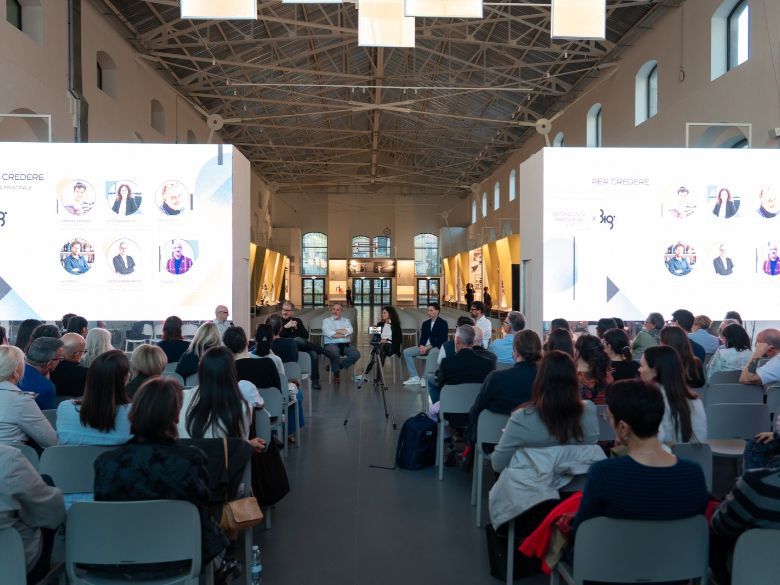
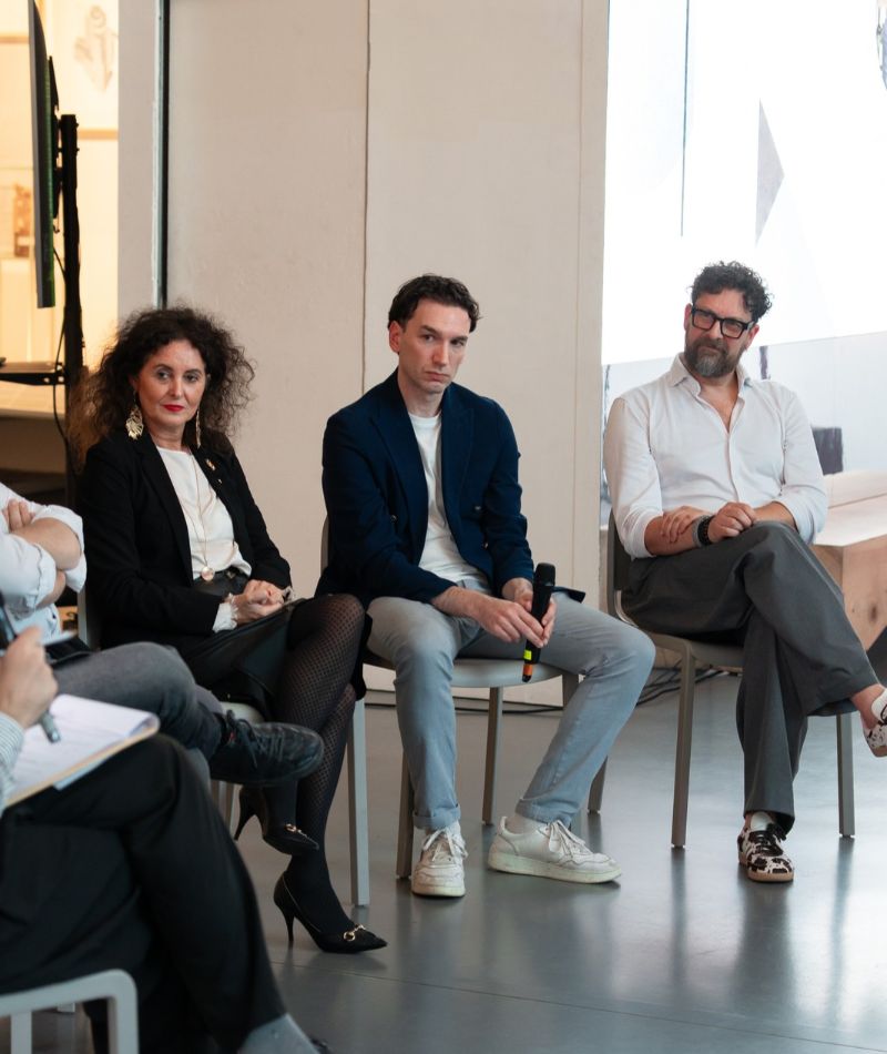
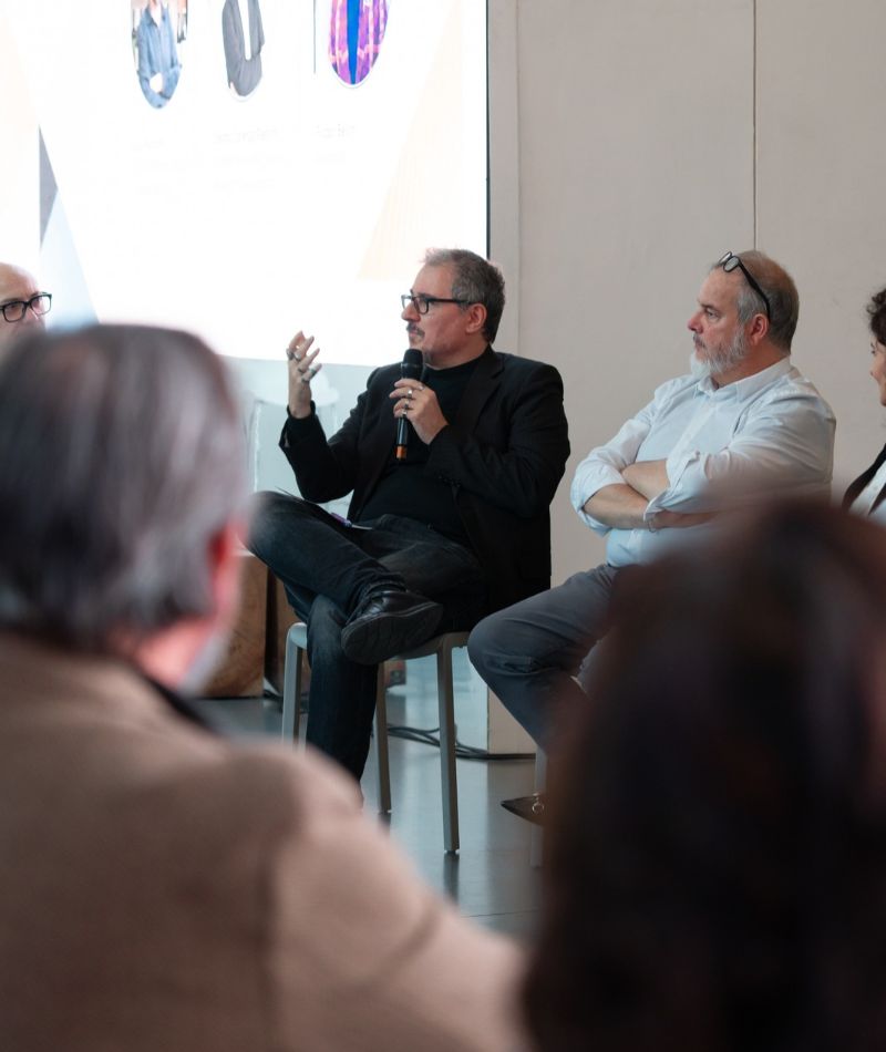
When it comes to luxury, accessibility is still seen as an issue for other markets. At the talk organized by Packaging Première Milan at the ADI Design Museum during the Biennale Internazionale di Grafica, this assumption was challenged right from the moderator Filippo Bellini’s first question. Massimo Duroni, an interior designer specializing in luxury and welfare, noted that luxury is changing: it no longer equates to opulence, and for those who already have everything, the true privilege is time. Meanwhile, environmental sustainability brings social sustainability in its wake, and “design for all” is no longer limited to people with disabilities. It concerns children, the elderly, and anyone who struggles to read a label, for example. Even an elegant box, if it gets stuck when pressed or is too heavy, becomes an obstacle for those with limited manual dexterity.
The most effective example was an object brought onto the stage: Bruno Munari’s “Zizì”- the designer’s first Compasso d’Oro award – packaged in a bag featuring a net-like graphic. The child frees the little monkey from its cage, and the packaging becomes an experience even before it serves as a container. This leads to a reflection on synesthesia: sight, touch, weight, sound, and scent all work together, and the designer must also consider where the product will be placed, at what height, next to what other items, and with what gestures it will be opened. In the luxury sector, packaging also has the potential to become a product in its own right one to be kept, reused, and made to last: a theme dear to eco-design.
However, in practice, accessibility and premium design struggle to come together. Luca Mancini, CEO and Creative Director of NSG Creative Agency, who discussed, among other things, the “Senza 1 Senso” project, rules out the idea that the fear of losing aesthetic impact is what’s holding things back. He believes the problem is cultural: we all have the five senses and take them for granted, so neither designers nor clients give them a second thought. For that project, the studio chose to “blind the sighted”: a completely black bottle with foil text that’s only legible when tilted, Braille for the visually impaired, and an NFC tag that, when a phone is held close, verbally describes the contents. He also pointed out that Braille can easily be incorporated into a very traditional label.The key is simply learning how to integrate them into the creative process.
The industry also plays a major role in shaping what is possible. Anna Paola Cavanna – President of Laminati Cavanna & Packaging Woman of Italy 2026 – who has been working in the flexible packaging sector for twenty-five years, noted that solutions we now take for granted, such as laser-cut easy-open features, doypacks, and resealable packages are the result of years of research. She brought along samples fresh off the production line: a laminate that will become a tray for salt cod, openable with one hand thanks to the skin film, and a lid for dried fruit with adhesive applied only in certain spots, making it peelable and resealable, a feature that also helps reduce food waste. Accessibility, she emphasized, is not just about convenience: opening packaging without scissors or knives also means avoiding product contamination, especially in the pharmaceutical industry. As early as 2020, Fondazione Carta Etica del Packaging had made this one of its core values.
The common thread linking many of the presentations was the supply chain. Alessandro Carnevale – Brand Ambassador & Sustainability Manager at Luxoro – spoke of a “burden” that increasingly falls on the designer’s shoulders, encompassing sales, sustainability, and obligations such as the European PPWR regulation. The way out, he said, using the image of Frodo carrying the ring, is to share it: to involve paper manufacturers, flexible material producers, finishing specialists, and printers from the very beginning. Mancini then confirmed that designers today take a holistic approach to guiding choices regarding paper, combinations and processing, while Cavanna explained that he opens the factory’s doors to brand owners so they can work together to find the right “recipe” of materials and finishes.
Within this collaborative effort, finishing can become a tool for accessibility rather than an obstacle. Carnevale explained that behind hot stamping lies a little-known technical element, the cliché, and that engraving it with cusp-shaped reliefs allows light to be refracted and the mirror-like gloss to be reduced without compromising the legibility of the lettering. The possibilities extend far beyond metallic foil: there is transparent foil, micro-engraving, digital engraving, and capacitive film.
Typography also plays a role in this perception. Cosimo Lorenzo Pancini – Founder & Creative Director at Zetafonts Type Foundry – explained that aesthetics and functionality are not at odds with one another, and he demonstrated this with an experiment: the same wine label, set once in Times New Roman and once in Bodoni, is perceived as more expensive in the latter case. A typeface like Montserrat is highly legible but lacks history and heritage, and this also affects perceived legibility. For this reason, typefaces should be chosen with the understanding that they tell a story, avoiding shortcuts that border on cultural appropriation. He urged caution regarding fonts designed for people with dyslexia: readability depends on paper, lighting, line spacing and spacing, and only last on the design of the letters.
The speakers agreed on the role of standards. According to Duroni, they serve as a useful baseline, but the risk is stopping there, because improvement comes at a cost, and companies tend to aim for the minimum. Pancini added that standards are a starting point, and the designer’s task is to take it a step further. Duroni then emphasized a simple principle: what the form promises must be consistent with what’s inside. A finish that gives the impression of a soft, high-quality product, but if the contents are disappointing, you’ll only buy it once.
Consistency also applies to sustainability. Carnevale noted that the public, especially younger consumers, immediately recognizes a false narrative, and that the effect is the opposite of “wow”; this is why certifications issued by external bodies are necessary. Cavanna reiterated that reputation is built over time and that reducing grams per square meter, using the right amount of adhesives and inks, and optimizing logistics are all part of the same equation. As for the PPWR, which promotes single-material products and is already in effect, the direction is now set, and companies that adapt first will fare better. Accessibility doesn’t always require a bigger budget or more special effects, but rather stepping out of one’s comfort zone, listening to others, and sharing the workload throughout the entire supply chain.
Lorem ipsum dolor sit amet, consectetur adipiscing elit Lorem ipsum dolor sit amet, consectetur adipiscing elit


