
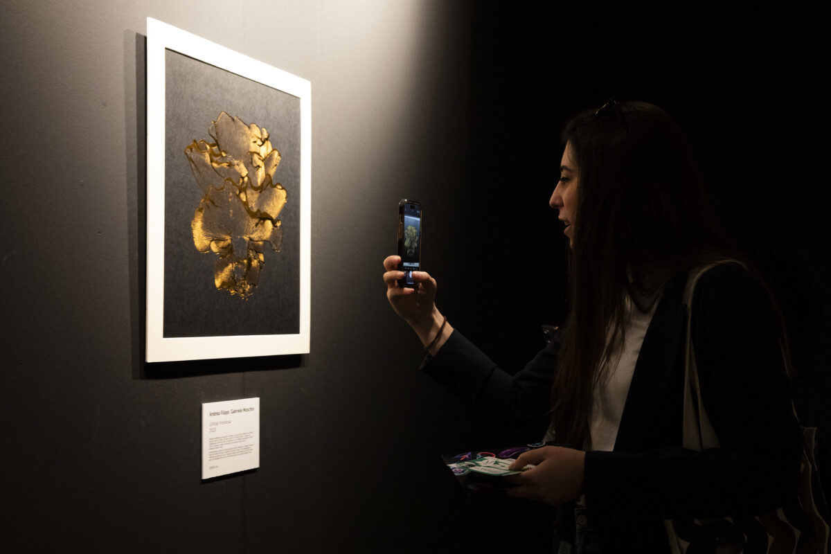
Packaging Première Milan strengthens its role not only as a benchmark for high-end packaging, but also as a cultural hub able to anticipate the language, aesthetics and visions of the industry. The 2026 edition finds its purest expression in the Art Gallery, the event’s space for artistic experimentation.
‘The Art Gallery is the heart of the Packaging Première cultural project, where our vision takes shape and is translated into a shared language between art and design,’ says Lara Castagna, Head of Event at Packaging Première.
The theme image for the 2026 edition of Packaging Premiere, created by paper artist Elisabetta Bonuccelli, is based on geometric origami that emphasises the importance of gesture, material and manual construction. Her research becomes the conceptual foundation of the entire exhibition project: a return to the origins of the form that, from craftsmanship, extends to the packaging supply chain, suggesting a new humanism of collaboration.
The Art Gallery 2026 is divided into an immersive journey consisting of three monochromatic rooms — white, red and black — each designed as a distinct emotional and perceptual environment. In this space, the fold becomes a trace, a rhythm, a visual tension; a gesture that leaves not only graphic but also conceptual marks. The Art Gallery 2026 is divided into an immersive journey consisting of three monochromatic rooms — white, red and black — each designed as a distinct emotional and perceptual environment. In this space, the fold becomes a trace, a rhythm, a visual tension; a gesture that leaves not only graphic but also conceptual marks. The protagonists will be nine artists (selected from the applications received through the call for artists, which is still open for a few days for designers, digital artists, graphics and illustrators), called upon to interpret the theme through a triptych: a white work, a red work, and a black work. The three works must dialogue as parts of a single project, while maintaining autonomy within their respective rooms. Not simple chromatic variations, but three complementary visions, capable of expressing a single idea in three atmospheres. The works will be on sale throughout the event.
Each colour is associated with a musical track by Anna Ox — Brughiera for white, Ramo for red, Lady Isabel for black — used not as an illustrative reference, but as an emotional and rhythmic impulse. Sound becomes structure, modulation, visual dynamics.
The theme explores manual skill as an active process: polygons, grids and patterns behave like rhythmic structures; ripples and discontinuities generate variations similar to sound modulations; overlays, textures and reliefs transform the sheet into a visual sculpture.
Light acts as a score, colour as rhythm, matter as gesture. Hybrid processes — from analogue to digital enable the simulation of impossible folds and distortions, while maintaining a strong printable materiality.
The works will be created on media provided by Winter & Company, while printing will be handled by Grafica Valdarno, the initiative’s technical partner.
Special thanks go to HAMK – Häme University of Applied Sciences (Finland), which promoted the project among its students, contributing with high-quality applications.
Registration is required to visit the event and is available at packagingpremiere.it. Admission is free and reserved for industry professionals.
Source: Selfridges
Lorem ipsum dolor sit amet, consectetur adipiscing elit Lorem ipsum dolor sit amet, consectetur adipiscing elit