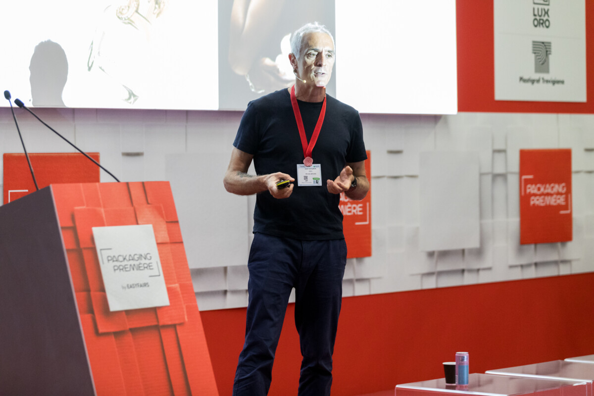
At Packaging Première Milan 2026, Juan Campderà – General Manager, Aktiva | Creative Design Agency – made a case that reframes inclusivity as a design discipline rather than a social gesture. His central claim: inclusive design doesn’t limit creativity, it expands it. And the market agrees – 47% of consumers now value easy-to-use certification, while 25% of younger consumers say they feel excluded by advertising that still targets a single, “average” customer.
Campderà’s first move was to dismantle the common misreading of “diversity” as a demographic category. Inclusive design, he argued, isn’t about designing for people with disabilities, or for specific genders or ethnicities – it’s about designing for the body everyone eventually inhabits. We’ve all been children, we all age, we can all suffer an injury or illness, and each of these states changes how we physically interact with packaging. Treating accessibility as a niche segment misses the point: standardization serves operations, not customers, and the industry’s old habit of designing for one “hero” user is increasingly out of step with a market that expects to be understood individually.
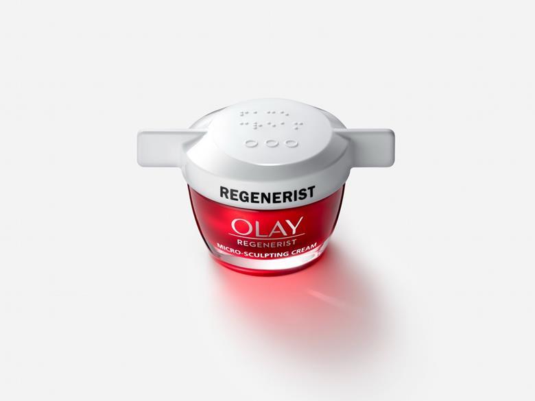
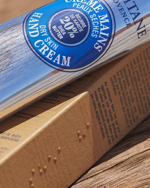
The talk’s most concrete thread was about shape as the primary vehicle of inclusion. Rexona’s hanging, easy-to-wrap deodorant format, Olay’s jar redesigned with Braille markings and wing-shaped grips, Herbal Essences’ Braille-printed bottles, and ergonomic spatula tooling built for reduced mobility were all cited as cases where the physical form of the object – not a disclaimer or an add-on feature – carries the accessibility. Campderà was explicit that these solutions don’t compromise aesthetics: fragrance bottles sized to fit the hand, magnetic closures replacing fiddly caps, and rounded, grippable silhouettes prove that ergonomic intelligence and premium positioning can coexist. Several of these products, he noted, became visually distinctive and commercially successful precisely because their shape solved a real physical problem.

The closing argument was strategic: accessibility has to enter at the briefing stage, not as a retrofit once a product already exists. Brands that started from a diverse user base – like Guide Beauty, designed for users with tremors or reduced grip strength, or Fenty’s fifty-shade range – created genuine market differentiation and stronger emotional connection with customers. Conversely, Campderà pointed to a Gen Z brand that mismanaged its shade range and was publicly called out, a reminder that inclusion done carelessly can backfire as hard as it can succeed when done well. His closing line summarized the thesis: designing for a broad target is still designing for a few – the real opportunity is designing for all.
Lorem ipsum dolor sit amet, consectetur adipiscing elit Lorem ipsum dolor sit amet, consectetur adipiscing elit