“Dream big, budget bigger”: design is not a luxury, it’s a strategy

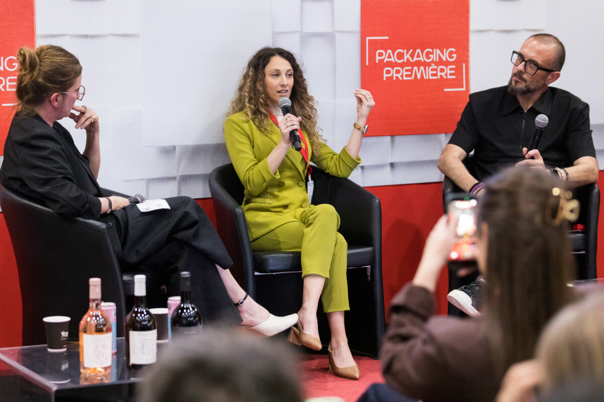
In the wine market, where standing out on the shelf is becoming increasingly challenging and packaging redesign cycles are growing shorter, the question of what makes a label truly effective continues to gain importance. Cantina Mezzacorona and All4Labels addressed this topic on the Future Stage at Packaging Première Milan 2026, not by searching for a purely technical answer, but by looking further upstream – at the strategic thinking that shapes design decisions from the outset.

Aesthetic appeal alone is not enough

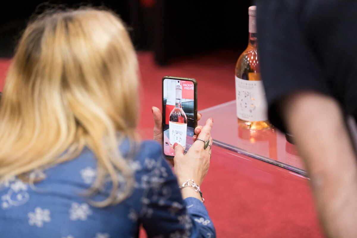
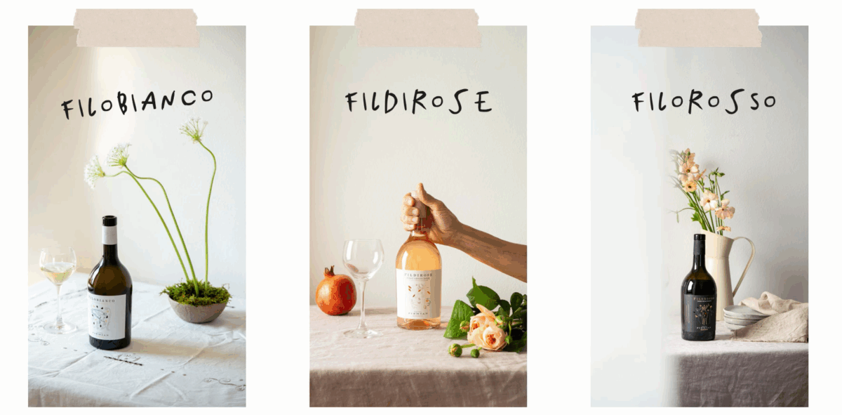
The starting question was clear-cut: is design an aesthetic gesture or a strategic choice? Barbara Darra, Global Marketing Manager at Cantina Mezzacorona, has no doubts – these two are not alternatives. A beautiful label disconnected from the brand’s DNA is a project that is “born flawed.” Strategy begins with storytelling – territory, history and values – and design must act as its visual translator, not as mere decoration. In the case of the Fili line, developed around historic Trentino grape varieties, this meant building on Alpine biodiversity as a coherent system of visual cues: every graphic element – the deer, the eagle, the references to mountain rural life – follows a rationale rather than personal taste.

The converter as an orchestra conductor

Roberta Moschella, Social Media Specialist & Event Specialist at All4Labels, redefined the role of the converter in terms that go far beyond printing: not as an executor at the end of the creative process, but as a cultural and technical partner involved from the very beginning. “We have to mediate between the designer’s creative freedom, the economic requirements of the purchasing department and the brand’s vision,” she explained. It is an uncomfortable position, but a necessary one. A converter involved late in the process can only optimise what already exists; one involved from the start can help shape the project’s direction – often by highlighting feasibility constraints that had not been considered upstream. All4Labels also presented the Motherland case study, its own showcase project for the wine & spirits sector: a project where the starting point was not aesthetic execution, but a fundamental question – how can a wine’s identity be translated visually? The answer came through a system of meaningful visual codes, rather than through a purely decorative choice.

The three-way collaboration

What all the projects presented on stage have in common is one essential condition: brands, designers and converters must work together from the very beginning, not one after another. “It is a three-way collaboration,” summarised Darra. But, as moderator Stefano Torregrossa, Creative Director of O,nice! Studio, pointed out, it is also a matter of trust and mutual understanding: the designer must embrace the values and language of a brand that is not their own; the brand must be able to understand and welcome an external perspective; and the converter must know when to provide expertise and when to step back. No one has all the answers, but the underlying dialogue is essential. When it is missing, the final product reveals it.

Condividi l'articolo

Facebook
LinkedIn

Lorem ipsum dolor sit amet, consectetur adipiscing elit Lorem ipsum dolor sit amet, consectetur adipiscing elit

The latest news from Packaging Première