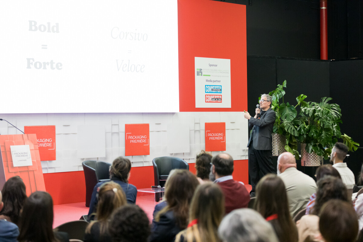
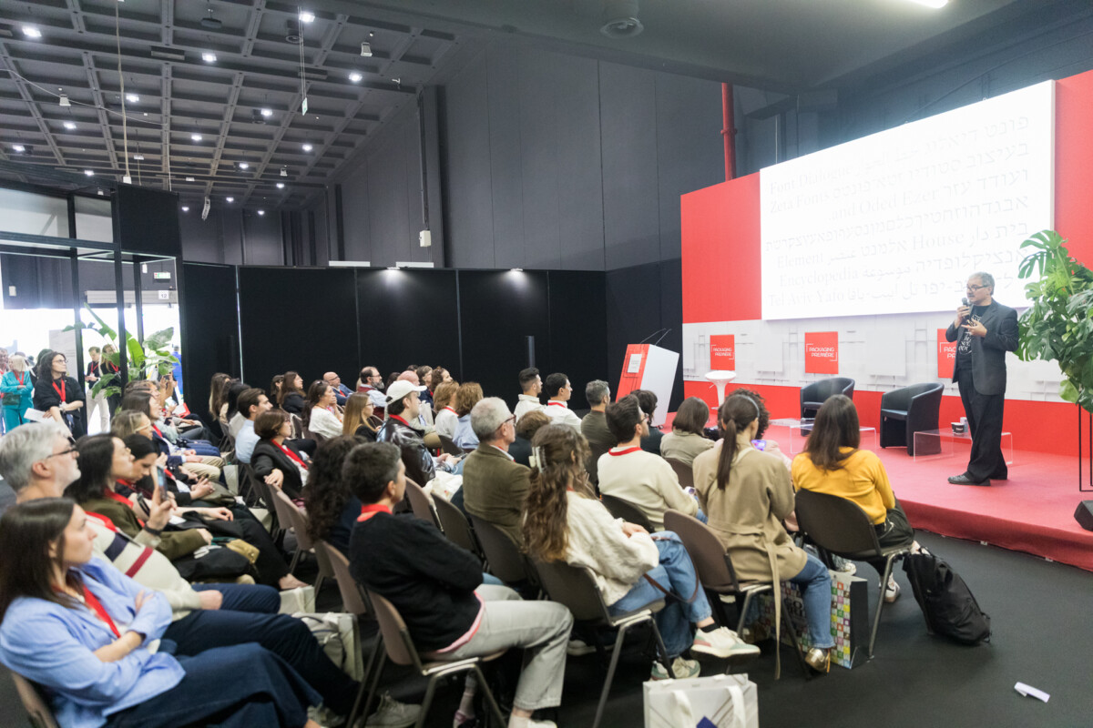
In a supermarket, faced with four bottles of wine they have never tasted, consumers are often able to identify the one they perceive as the most expensive even before reading the label. According to those who design typefaces professionally, this judgment is rarely driven by colour or packaging shape – it is driven by the font. This insight emerged at Packaging Première Milan 2026 during the talk by Cosimo Lorenzo Pancini, Founder and Creative Director of Zetafonts Type Foundry, who brought to the stage a still underexplored topic in the industry: typography as a direct lever on a product’s perceived value.
One alphabet can be more expensive than another
The core idea is simple: even before a text is read, the typeface used to write it already communicates something. Elegant and sophisticated fonts shift the perception of a product towards luxury, while technical or impersonal typefaces push it towards a more conventional positioning. This phenomenon has been described by British researcher Sarah Hyndman as “typographic synaesthesia” – the ability of letters to evoke sounds, weights, speeds, and even tactile sensations simply through their form. For packaging, this means that the choice of font is not an accessory aesthetic decision, but a genuine market positioning tool, comparable to the selection of materials or colour palette.
Cultural codes, not universal rules
Perception is never neutral – it is shaped by the visual references people have accumulated over time. Pancini illustrated this through the example of two very different typefaces: one inspired by forms associated with a popular, informal aesthetic – like Cooper Black, historically linked to fast-food branding and 1970s commercial advertising – and another designed to convey elegance and refinement, evoking the world of fine dining. It is this latter visual language that Zetafonts adopted when developing the typographic identity for Artusi, aiming to communicate Italian culinary heritage and expertise. The same principle was applied in a different context for a premium jam range, where an Art Deco typeface, inspired by the 1930s, helped convey exclusivity before consumers had even read the label. In every case, typography does far more than simply “dress” a product: it defines the brand’s promise before a single word is read.
A competitive field still largely untapped
While the physical aspects of packaging – materials, shapes, and sustainability – have become well-established areas of investment for brands, typographic design is still often treated as an afterthought, relying on generic font libraries. Yet, as highlighted during the talk, it is precisely in the most crowded and least differentiated product categories – such as wine, coffee, baked goods, and beverages – that typography can become a genuine competitive advantage. It offers brands a way to build a distinctive identity without necessarily changing the materials or structural design of the packaging. In an industry where sustainability has already pushed brands to rethink every stage of the production process, typography remains perhaps the most cost-effective – and the most leveraged – tool for influencing a product’s perceived value.