Mack & Schühle’s Genevitis challenges wine packaging: a supply chain project rooted in local identity

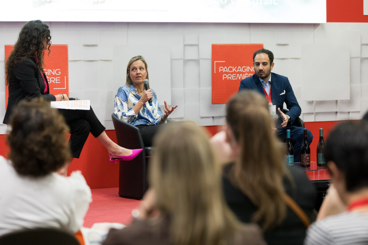
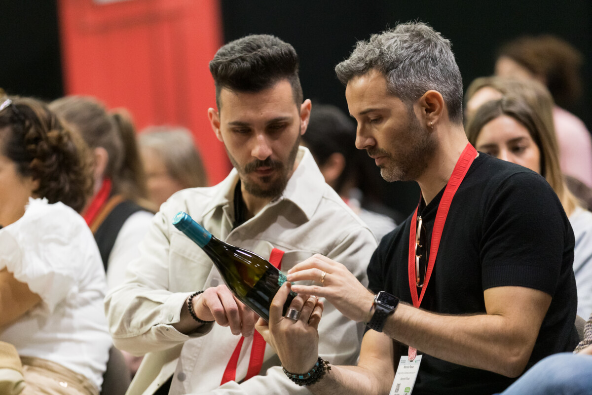
In the wine industry, redesigning a label is often an internal brand decision: brief, agency, output. Mack & Schühle Italia’s Genevitis project takes a different approach – one where the difference is not aesthetic, but structural. Presented at Packaging Première Milan 2026 by Gianluca Digrisolo, Senior Marketing Manager at the company, and Wine Designer Federica Cecchi, the project offered a concrete perspective on what it means to build an identity-driven packaging system on a national scale, bringing together six regions, six wineries, six local designers and an equal number of technical partners.

A creative supply chain, not just a wine project

The premise behind Genevitis is that no one understands a territory better than those who live there. This belief led to the decision to work with local designers for each of the six regions involved in the project – Lazio, Puglia, Abruzzo, Campania, Sardinia and Piedmont – instead of centralising the creative process. This is not only a narrative choice: it is an organisational model with tangible implications for the complexity of the project. Six designers, six wineries, six technical partners for the packaging components and a shared brand ambassador. Mack & Schühle acted as the connecting force between all these stakeholders, taking on what Digrisolo described as the role of “project guardian”: not a commissioner imposing decisions, but a coordinator bringing a shared vision to life.

The process: years, not weeks

One of the most significant aspects highlighted during the talk was the transparency around timelines. Digrisolo openly explained that the project, from its initial concept to the first launches, took years to develop – something that is rarely visible from the outside, especially to the end consumer. Before the creative phase began, months of market analysis were dedicated to identifying the most representative references for each territory, both in terms of trends and recognisability. Only after this stage did the designer selection process and concept development begin. The Lazio case, in particular, proved to be a successful example of alignment: the concept developed by Cecchi quickly found a shared direction, helping to shorten the creative phase.

From territory to label: Federica Cecchi’s approach

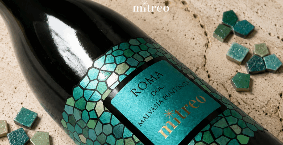
For the Lazio project, developed in collaboration with the Gotto d’Oro cooperative, Cecchi chose the Mithraeum of the Castelli Romani – a 2nd-century AD archaeological site rich in frescoes – as her starting point. As she explained, the challenge was not to simply illustrate historical heritage, but to avoid a “museum-like” effect: packaging intended also for large-scale retail must capture attention within seconds, while still conveying a deeper story. The chosen method was subtraction: the fresco was broken down into independent visual elements – like pieces of a mosaic – each carrying a fragment of identity. The logo is a star taken from the cloak of the god Mithras, reinterpreted in a contemporary way. The selected typeface is Trajan, referencing Trajan’s Column. The colour palette derives directly from the fresco’s chromatic details and was associated with the three wine references – a Frascati DOC, a Roma Rosso DOC, and a Roma DOC. The labels feature embossed details and textures inspired by mosaic techniques, created with technical partners selected to meet the project’s sustainability criteria. This same principle also guided the choice of lighter bottles, supporting Mack & Schühle’s goal of reducing emissions.

Condividi l'articolo

Facebook
LinkedIn

Lorem ipsum dolor sit amet, consectetur adipiscing elit Lorem ipsum dolor sit amet, consectetur adipiscing elit

The latest news from Packaging Première