Packaging Première Milan strengthens its role not only as a benchmark for high-end packaging, but also as a cultural hub able to anticipate the language, aesthetics and visions of the industry. The 2026 edition finds its purest expression in the Art Gallery, the event’s space for artistic experimentation.
‘The Art Gallery is the heart of the Packaging Première cultural project, where our vision takes shape and is translated into a shared language between art and design,’ says Lara Castagna, Head of Event at Packaging Première.
The theme image for the 2026 edition of Packaging Premiere, created by paper artist Elisabetta Bonuccelli, is based on geometric origami that emphasises the importance of gesture, material and manual construction. Her research becomes the conceptual foundation of the entire exhibition project: a return to the origins of the form that, from craftsmanship, extends to the packaging supply chain, suggesting a new humanism of collaboration.
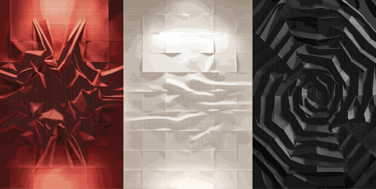
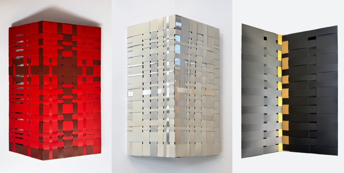
The Art Gallery 2026 is divided into an immersive journey consisting of three monochromatic rooms — white, red and black — each designed as a distinct emotional and perceptual environment. In this space, the fold becomes a trace, a rhythm, a visual tension; a gesture that leaves not only graphic but also conceptual marks. The protagonists will be nine artists (selected from the applications received through the call for artists, which is still open for a few days for designers, digital artists, graphics and illustrators), called upon to interpret the theme through a triptych: a white work, a red work, and a black work. The three works must dialogue as parts of a single project, while maintaining autonomy within their respective rooms. Not simple chromatic variations, but three complementary visions, capable of expressing a single idea in three atmospheres. The works will be on sale throughout the event.
Each colour is associated with a musical track by Anna Ox — Brughiera for white, Ramo for red, Lady Isabel for black — used not as an illustrative reference, but as an emotional and rhythmic impulse. Sound becomes structure, modulation, visual dynamics.
The theme explores manual skill as an active process: polygons, grids and patterns behave like rhythmic structures; ripples and discontinuities generate variations similar to sound modulations; overlays, textures and reliefs transform the sheet into a visual sculpture.
Light acts as a score, colour as rhythm, matter as gesture. Hybrid processes — from analogue to digital enable the simulation of impossible folds and distortions, while maintaining a strong printable materiality.
A preview of some of the works exhibited at the Art Gallery 2026.
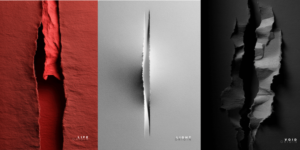
Project: “ORIGIN”
Artist: Aimonia
The works explore paper as an original surface, where tears and folds transform the sheet into space, light, and matter. In each triptych, white suggests birth and possibility, red evokes energy, growth, and transformation, while black opens onto emptiness and dissolution. Through this creative gesture, paper ceases to be a mere support and becomes a site of birth and metamorphosis, narrating different forms of origin and inviting the viewer into an immersive and poetic visual experience.
2. Daria Songo e Yuliya Salukvadze
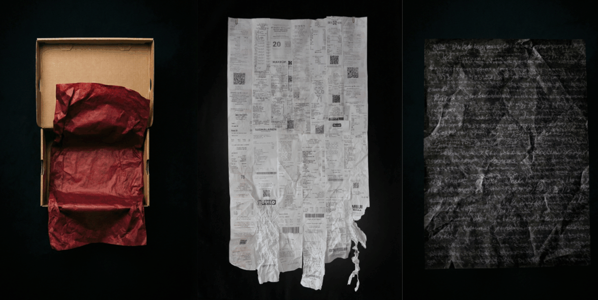
Project: “The paper bears witness”
Artists: Daria Songo e Yuliya Salukvadze
This triptych explores the mechanics of adaptation through a vocabulary of paper, utilizing accumulated artefacts from the migration process. The project captures three stages of integration: The Border – the legitimization of presence; The Arrangement – the acceptance of a forced function; The Palimpsest – the layering of new experience upon the old foundation.
It is the transformation of disposable material into a monumental chronicle, where every fold is not an accident, but a permanent mark of the path taken.
3. Elsa Babkova
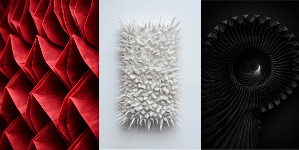
Project: “ORIGIN IS A LIE”
Artist: Elsa Babkova
Origin Is a Lie questions the myth of the pure beginning. Emergence is unstable, repetition shapes identity, and every ending folds back into what came before. Through Ortus, Fluxus, and Limen, the works reveal that there is no pure beginning. Each form carries its past within it. The beginning is not a point — it is a process.
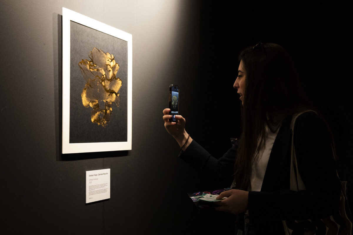
4. Filippi e Moschin
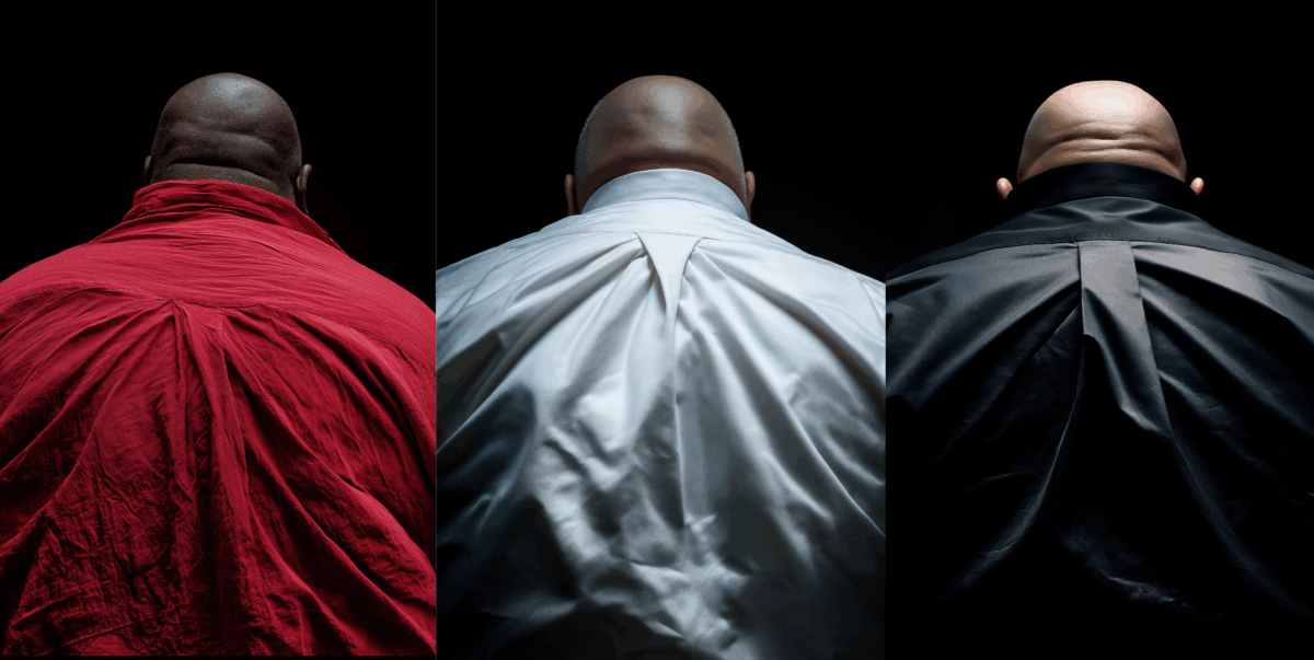
Project: “THE BACK TRILOGY”
Artists: Andrea Filippi e Gabriele Moschin
The Back Trilogy unfolds through three rear portraits conceived as acts of origami: pleated surfaces as Folded, and human bodies as Realities. In a culture of frontal branding and engineered spectacle, the back withdraws from the consumer gaze, folding identity into skin and fabric. Curved volumes oppose the rigidity of display, while the central fold becomes seam and incision, where image, body and packaging converge. The shaved head reduces the figure to structure: constructed, staged, exposed.
5. Li Tao
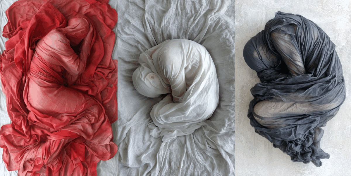
Project: “Body in Fabric”
Artists: Li Tao
Body in Fabric is a visual exploration of the relationship between the human body and fabric, where the body is transformed into a soft, abstract, sculptural form. Fully wrapped in cloth, the figure loses its identity and becomes a surface defined by folds, tension, and volume.
The work focuses on the dual nature of fabric as both a protective and restrictive element. It conceals the body while simultaneously revealing its presence through pressure, weight, and movement.
Through three chromatic states—white, red, and black—the project expresses different emotional atmospheres: calmness, tension, and silence. These images exist in a liminal space between fashion, sculpture, and digital construction, questioning how material can redefine the perception of the body.
6. Mariia Khomenko
Project: “Trajectory of an impulse”
Artists: Mariia Khomenko
Trajectory of an Impulse flows from the purity of White Flow—a visual silence of soft folds—into the force of Pulsation. In this red density, a vertical module meets fluid ridges like a sudden crescendo. The cycle ends with Shadow and Limit, where organic curves yield to rigid architectonics. Black absorbs all light through tectonic shifts and sharp edges. This vortex marks the point of crystallization, where the triptych’s rhythm reaches its absolute limit.
7. Michele De Matthaeis
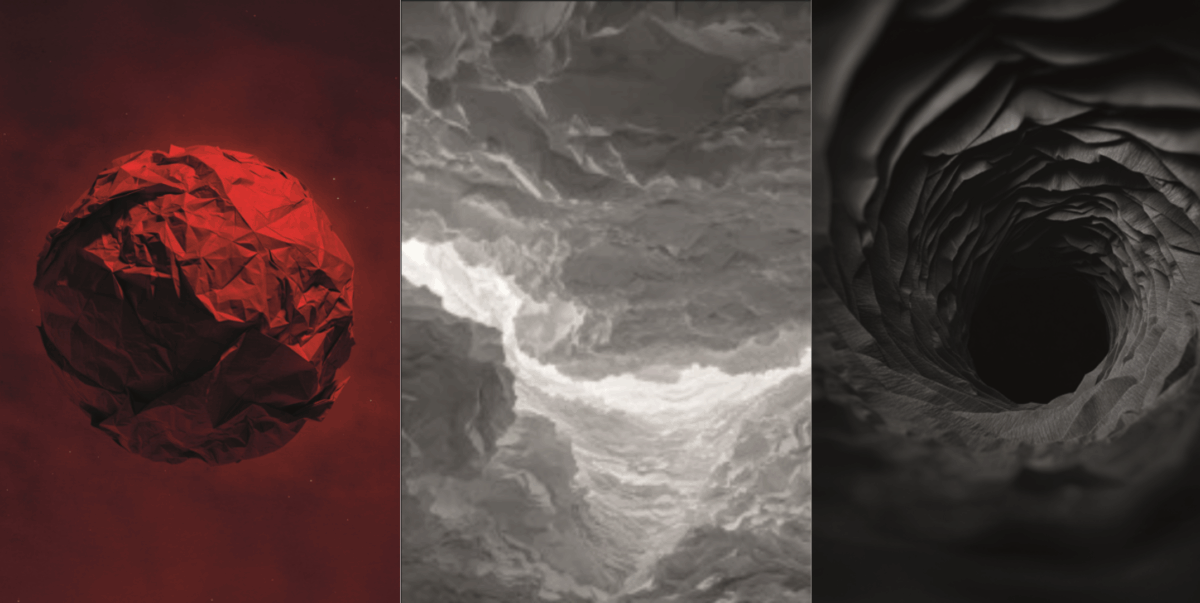
The works transform paper into space and matter: in white, the fold opens like a breath; in black, it gives way, revealing absence and vulnerability; in red, it concentrates into energy and generative force. A triptych that tells of birth, metamorphosis, and memory.
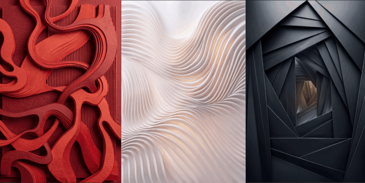
8. Viktoria Selusenkova
Project: “FOLDED FREQUENCIES”
Artist: Viktoria Selusenkova
Folded Frequencies is a triptych that explores the fold as a sonic trace – a visual residue generated by sound, pressure, and time. The three works translate audio waves into folded, gridded surfaces, where rhythm becomes structure and music leaves a physical mark. Rather than illustrating sound, the project treats audio as a force acting on matter. Frequencies compress, fracture, and stretch a modular grid, transforming a flat surface into a field of tension, relief and illusionary depth. The grid functions ad a shared structural language across triptych, while folds operate as moments of interruption – creases produced by rhythm, pauses and intensity.
9. Chiara Complice
Project: “DOVE LA MATERIA TIENE “
Artist: Chiara Complice
It is a work that explores matter as something that changes while at the same time endures. Through interwoven forms and visual tensions, it shows transitions between different states—energy, density, and lightness—without ever reaching a breaking point. The colors (red, black, white) highlight these conditions, while the structure holds everything together, suggesting continuity and persistence within change.
The works will be created on supports provided by Winter & Company, while the printing will be handled by Grafica Valdarno, the technical partner of the initiative.
A special thanks goes to HAMK – Häme University of Applied Sciences (Finland) and Domus Academy which promoted the project among its students, contributing with applications of outstanding quality.
Registration is required to visit the event and is available at packagingpremiere.it. Admission is free and reserved for industry professionals.
Source: Selfridges
Lorem ipsum dolor sit amet, consectetur adipiscing elit Lorem ipsum dolor sit amet, consectetur adipiscing elit